Dashboard for Scholar Comparison

Full description
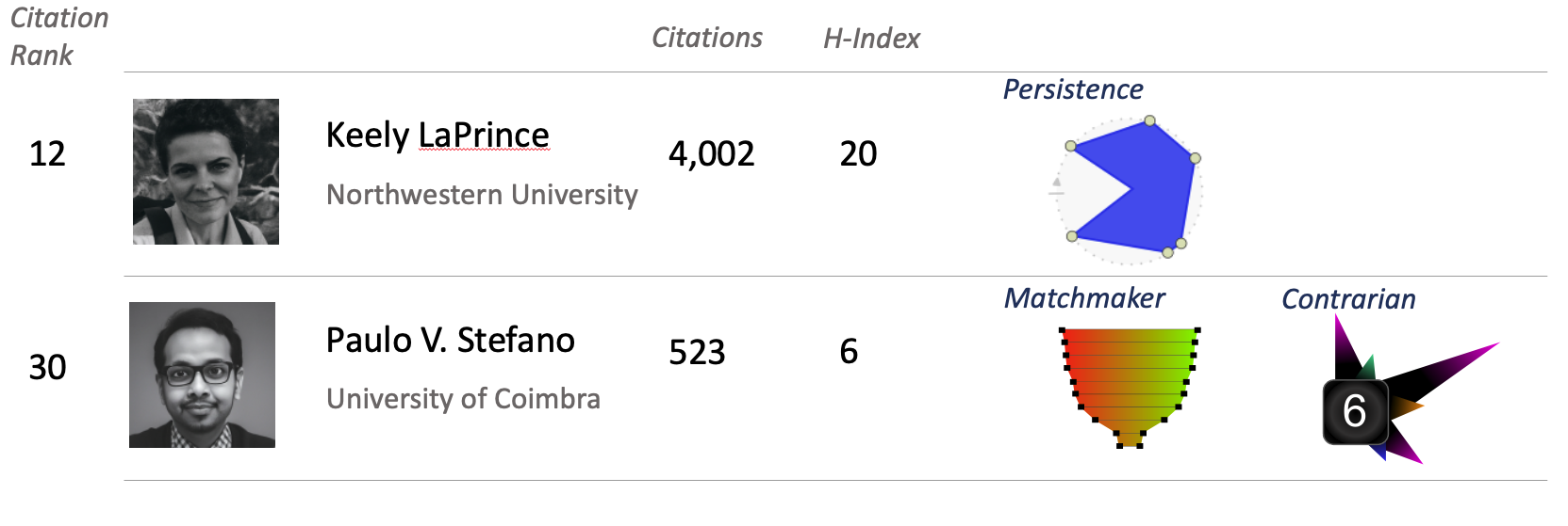
A dashboard featuring thumbnail photos of two scholars and organized in rows and columns. Each row is for a different scholar. The columns from left to right hold a scholar’s citation rank, photo, name with institutional affiliation, number of citations, H-Index score, and badges as described abocve. The fictional scholar in the top row (“Keely LaPrince,” Northwestern University, Citation Rank of 12, 4,002 total citations, and an H-Index of 20) has only one badge, the “locket” from Figure 19.3, indicating sustained attention to an author. The second hypothetical scholar (“Paulo V. Stefano,” University of Coimbra, Citation Rank of 30, 523 total citations, and an H-Index of 6) has two badges, one in each of the rightmost columns. The first is the “goblet” from Figure 19.5, indicating high Matchmaker Scores. The second is the “porcupine” from Figure 19.1, indicating high contrarianism.
Comments
to view and add comments.
Annotations
No one has annotated a text with this resource yet.
- typeImage
- created on
- file formatpng
- file size175 kB
- copyright statusauthor of chap 18 (Booten)
- creatorKyle Booten
- rights holderKyle Booten